Ask an AI assistant about your top overdue invoices and you get the same thing every time: a wall of text. Accurate, maybe — but your AP lead now has to read a paragraph to extract what a table would have shown in two seconds. Numbers in prose don't compare, don't sort, and don't survive being pasted into a Monday meeting.
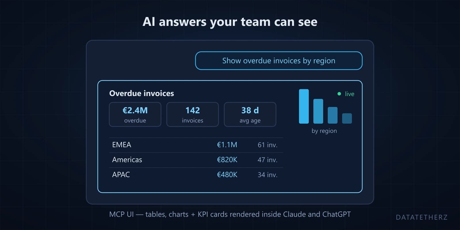
MCP UI fixes the last step. It's the part of the Model Context Protocol that lets a server return not just data but an interface — a real, rendered view that appears inside the chat. Ask the question in Claude or ChatGPT, and instead of prose you get a live table, a chart, a row of KPI cards. The answer arrives looking like an answer.
What MCP UI actually is
The MCP standard started with tools: functions an AI can call to fetch or change data. MCP UI (you'll also see "MCP Apps") extends that with UI resources — views the server defines and the AI client renders in the conversation. The AI still calls your governed tools for the data; the view is how the result is presented.
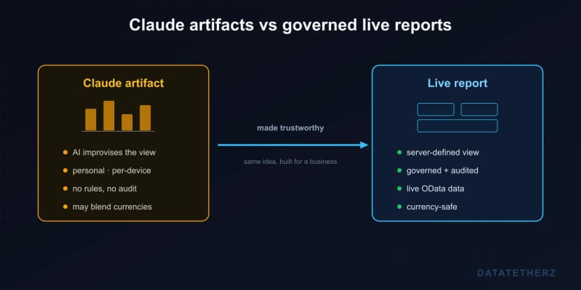
The important design property: the interface comes from the server side — from the platform that knows your data — not from the AI improvising HTML. That means the same view renders consistently, shows the fields you chose, and inherits every rule you set. It lives inside the AI your team already uses; nobody learns a new portal.
What teams actually use it for
The patterns we see map to how people already consume ERP data:
- Data tables — overdue invoices, open orders, stock below reorder point: sortable rows where prose would bury the numbers.
- KPI cards — the four figures a manager checks every morning, rendered as cards the moment they ask.
- Charts — revenue by region, order trend by quarter, drawn from live OData in the chat.
- Lists and detail views — scan a result set, open one record with the fields that matter.
- Card grids, tabs, and composed layouts — a small operational dashboard, assembled from the pieces above.
The common thread: these were all "someone should build a report for that" requests. Now they're answers to a sentence.
The part that used to require a frontend team
Here's the honest catch with raw MCP UI: hand-building it means writing view code inside your MCP server — the same server you were already maintaining, now with a frontend project inside it. The interface work that made BI rollouts slow comes back through the side door.
This is where we've put the platform's weight. In DataTether, the views come from the same place the tools do — the OData metadata you already connected — and building one is a drag-and-drop exercise, not a codebase:
- Drag the view together. Pick widgets — table, chart, KPI cards, detail view — and arrange the layout.
- Point each widget at your data. Bind it to the entities and fields you exposed; labels, formats, and readable names come from your configured metadata.
- Turn it on. The view publishes to the same MCP endpoint your tools live on.
- Ask. Anyone on the team asks the question in Claude or ChatGPT and the view renders in the chat.
No React project, no component library decisions, no deploy pipeline for a dashboard. The person who knows the data — the SAP admin, the operations lead — ships the interface themselves, in an afternoon.
Governed like everything else
A rendered view changes none of the security posture, and that's deliberate. Widgets can only display entities and fields you exposed — a chart can't leak a column your scopes keep dark. Any action a view offers goes through the same approval gates as every other write: reads render freely, changes wait for a named human. And it's all logged in the same audit trail that covers your tools.
One detail we're particular about: numbers don't lie by accident. If a query spans multiple currencies, DataTether won't silently sum euros with dollars into one impressive, wrong KPI — mixed-currency aggregates are split or blocked rather than blended. A dashboard your CFO might screenshot has to earn that trust.
Why this matters more than it looks
The gap between "AI that answers" and "AI your team actually works in" is mostly presentation and trust. When the answer shows up as a governed, readable view — inside the assistant people already have open — usage stops being a pilot metric and becomes a habit. That's the value of the whole stack landing at once: one connection, auto-generated tools, and now interfaces, without your team writing any of the three.
There's a deeper dive with visuals on our MCP UI page. And if you want to see your own ERP data rendered in a chat — tables, KPIs, the lot — request guided access: building the first view together takes about as long as reading this post did.

 mcp-ui